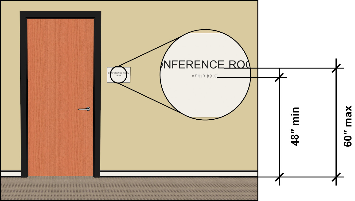
Signs identifying permanent rooms and spaces — restrooms, room numbers, exits, floor suites — must comply with the ADA’s tactile signage rules, while directional and informational signs only need visual compliance (2010 ADA Standards §216.2–§216.4). The three specs inspectors and sign buyers get wrong most often: tactile characters must mount 48″–60″ above the finish floor measured from the character baseline (§703.4.1), braille must be Grade 2 with domed dots (§703.3), and characters must use a non-glare finish with light-on-dark or dark-on-light contrast (§703.5.1).
This checklist is built for buyers, contractors, and facility managers: the exact spec table with official citations, a room-by-room breakdown of which doors actually need tactile signs, the five violations we see re-manufactured most often, and a door-measurement workflow that gets ADA signs fabricated right the first time.
The Official Spec Table: Every Number and Where It Comes From
Bookmark this table. Every figure below comes from the 2010 ADA Standards for Accessible Design published by the U.S. Access Board — the same sections your inspector or architect will cite.
| Spec | Requirement | Official Source (2010 ADA Standards) |
|---|---|---|
| Tactile character height | 1/2″ min – 2″ max; 5/8″ min when raised characters also serve as the visual characters (the standard case for room signs) | §703.2 |
| Stroke thickness | Max 15% of character height (measured on uppercase “I”) | §703.2 |
| Character style | Uppercase, sans-serif; no italics, scripts, or decorative fonts; character width 55%–110% of height | §703.2 |
| Raised depth | 1/32″ minimum | §703.2 |
| Character spacing | 1/8″ min to 4× stroke width between letters (rectangular cross-section) | §703.2 |
| Braille grade | Grade 2 (contracted); Unified English Braille (UEB) acceptable; domed/rounded dots | §703.3 |
| Braille dot specs | Dot height 0.025″–0.037″; dot diameter 0.059″–0.063″ | §703.3 |
| Braille position | Below the entire raised text, 3/8″ minimum clearance from tactile characters and any raised border | §703.3 |
| Mounting height | 48″ min – 60″ max above finish floor, measured from the baseline of the lowest and highest tactile characters | §703.4.1 |
| Location at door | On the latch side of the door; on double doors, the inactive leaf or right side | §703.4.2 |
| Clear floor space | 18″ × 18″ minimum, centered on the tactile characters, outside the door swing, with 80″ headroom | §703.4.2.1 |
| Finish & contrast | Non-glare finish; characters must contrast with background, light-on-dark or dark-on-light. (The Standard sets no numeric value — a 70% LRV contrast difference is the widely used accessibility benchmark.) | §703.5.1 |
| Elevator jamb signs | Elevator controls and hall call buttons are exempt from the 48″–60″ range | §407 (see §703.4.1 exception) |
Two details that even experienced sign companies miss: the 48″–60″ range is measured from the baseline of the tactile characters, not the top or bottom of the sign plate — a 9″ sign centered wrong still fails. And the non-glare + contrast rules (§703.5.1) apply to the raised characters’ finish, which is why glossy acrylic faces and polished metals are common rejection reasons on otherwise-correct signs.
Which Doors Actually Need a Compliant ADA Sign? (Room-by-Room)
The trigger is not “every door.” The Standard distinguishes signs identifying permanent rooms and spaces (tactile + visual required) from directional and informational signs (visual only) — §216.2 and §216.3. Here is how that plays out in the five building types we ship most.
Office Buildings
| Sign | Tactile Required? | Why |
|---|---|---|
| Suite / room numbers (101, 102…) | Yes | Permanent space designation, §216.2 |
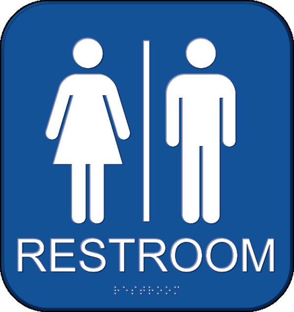
| Restroom doors | Yes | Permanent space, §216.8 |
| Room name plates (“Conference Room A”) | Yes | Identifies a permanent space, §216.2 |
| Door decals (“Sales Department” on a glass office) | Yes if the space is permanent | §216.2 — glass applications still need the tactile sign adjacent, on the latch-side wall |
| Directional signage (“Restrooms → down the hall”) | No | Directional, §216.3 — visual rules only |
| Building directory | No | Informational, §216.3 |
| Company name / logo sign | No | Not a room designation, §216.2 exception |
Restaurants & QSR
- Yes (tactile): restrooms, exit stairwell doors (§216.4.1), any permanent back-of-house rooms that carry designations, and the accessible entrance when not all entrances are accessible (ISA symbol per §216.6).
- No (visual only): menu boards, “Employees Only” style directional text where the space is transient, promotional signage, waiting-area directional signs.
- The restroom door is the single most-inspected sign in this category — and the most commonly re-fabricated. Get it right with the spec table above.
Hotels
- Yes (tactile): room numbers on every guest-room door (§216.2), restrooms and bathing rooms (§216.8), exit stairwells and exit doors (§216.4), floor designations, housekeeping and service rooms with permanent designations, and elevator jambs (floor designations per §407.2.3.1, which has its own spec rather than the 48″–60″ range).
- No (visual only): “Pool this way” directional signs, amenity hours, branding, ballroom event signage.
- Multi-floor rollouts are where hotels feel ADA mistakes financially: a wrong braille grade on 12 floors × 20 doors is 240 signs to re-make.
Medical, Dental & Clinics
- Yes (tactile): exam room numbers, restroom doors, exit stairs, and areas of refuge (§216.4), plus graphic symbols with 6″ minimum field height and tactile text beneath (§703.6) where pictograms designate permanent rooms.
- No (visual only): departmental wayfinding (“Imaging → 2nd Floor”), waiting-room informational boards, signage within exam rooms.
- Medical buildings are inspected frequently and often carry state-level rules on top of the ADA (California Title 24 is the classic example) — confirm the state overlay before ordering.
Parking Areas
- Yes: each accessible parking space must be identified by a sign with the International Symbol of Accessibility (§216.6, §502.6), including the “van accessible” designation; signs must meet the visual character and contrast rules.
- Note the parking-specific geometry: §502.6 requires the sign bottom at 60″ minimum above the ground — a different rule from interior tactile signs, and a frequent site-inspection failure.
- No (tactile): general directional parking signage (“Level 2 →”) — visual rules apply.
Top 5 ADA Sign Violations (and What Each One Costs You)
These five account for the overwhelming majority of ADA sign failures we see in the North American market — including on signs that were already “done” once and had to be re-ordered.
1. Wrong mounting height (or measured from the wrong point)
The rule is 48″–60″ from the baseline of the tactile characters to the finish floor (§703.4.1). Installers routinely hang the sign plate at 48″, pushing the baseline to 40-something inches — out of range on a small-character sign. Consequence: the sign itself may be perfectly fabricated, but it fails inspection and has to be re-installed (or re-manufactured with a taller layout) — plus the inspector’s return-visit timeline can hold up your certificate of occupancy.
2. Non-Grade-2 or wrong-spec braille
Burst dots (injected plastic that doesn’t hold a dome), flat dots, dot heights outside 0.025″–0.037″, or braille that reads as literal rather than contracted (§703.3). Screen-printed “braille” fails outright. Consequence: full re-fabrication — braille cannot be fixed in the field — plus potential complaints from visually impaired users, which is where ADA litigation typically starts. Title III violations carry federal civil penalties that have run into the tens of thousands of dollars per violation cycle, before legal fees.
3. Contrast and glare failures
Shiny silver letters on a white wall, glossy acrylic faces, or decorative script fonts (§703.2, §703.5.1). The Standard requires non-glare finish and light/dark contrast — and while it sets no number, the 70% LRV difference benchmark is what most consultants and AHJs actually apply. Consequence: re-fabrication with correct finishes, plus schedule slip.
4. Wrong door position
Sign mounted on the door leaf itself, on the push side, or above the door — instead of on the latch side with an 18″ × 18″ clear space centered on the characters (§703.4.2). Narrow vestibules and back-of-house corridors are the usual trap: there’s no latch-side wall at all. The Standard anticipates this — mount on the nearest adjacent wall — but the call has to be made before fabrication, not after install. Consequence: sign re-located (acceptable) or re-designed for a different substrate (not acceptable), plus a second inspection fee in many jurisdictions.
5. Missing signs entirely — the “no sign” violation
The most expensive violation is the one that never gets ordered: exit stairwell doors (§216.4.1) and permanent-room designations left off during construction because “the GC was supposed to do it.” Consequence: this is where real ADA exposure lives — complaints and demand letters target missing accessible signage far more than crooked plates. It’s also the cheapest to prevent with a per-door schedule before drywall closes.
Send the Factory Your Door Data — Get Signs That Pass the First Time
Here’s the part most sign guides skip: most ADA violations are manufacturing decisions, not inspection surprises. The braille grade, dot spec, character height, and mounting layout are all fixed at fabrication. Folomei’s production team builds ADA signage to the §703 specs above as standard — but we can only match the sign to your actual doors if we get real door data, not just a logo.
The Door Data Sheet: What to Send for a One-Pass Install
For each door, send five lines:
- Room name / number — exactly as it should appear, including capitalization (braille follows §703.3 capitalization rules: sentence-case wording, capitals only for proper nouns, initials, and room numbers/letters).
- Latch-side wall width — measure from the door frame edge to the first obstruction (corner, panel, light switch). We confirm your sign size fits, or we re-layout the character height within the compliant range (1/2″–2″, §703.2) before anything is cut.
- Door swing — in-swing or out-swing, single or double leaf. This determines whether the 18″ × 18″ clear floor space (§703.4.2.1) is achievable at that location and where the sign can legally sit.
- Wall finish and color — drywall, masonry, tile, or glass sidelight, plus the paint color or finish photo. We check the contrast against the sign’s background finish toward the 70% LRV benchmark and can flip the sign’s color scheme (dark-on-light / light-on-dark) per door — free.
- Install surface — standard drywall, masonry, or glass. This decides the mounting hardware (adhesive, standoff pins, or hybrid) that ships with the signs, so your installer isn’t improvising with double-sided tape at 7 a.m.
What You Get Back
- A free 3D mockup of your ADA sign set with the exact layouts, colors, and braille placement — before any deposit.
- Per-sign mounting templates with the 48″–60″ baseline pre-calculated, so installers set height from the template line, not a tape-measure guess.
- Material options matched to code and budget: raster-braille acrylic (the workhorse), photopolymer (crisp dot spec, ideal for large multi-floor rollouts), and aluminum-faced plates — all non-glare finishes with verified contrast.
- UL/ETL certified production standards across our illuminated product lines, and ADA signage produced to the published §703 dimensional specs with QC checks on dot height and character depth.
This is the same door-data workflow our hotel and clinic clients use for 200+ sign rollouts: one data sheet per door type, one approved mockup, then batch fabrication — no per-door surprises, no re-ordered signs.
FAQ: ADA Sign Requirements, Answered Straight
What height do ADA signs need to be mounted?
Between 48 and 60 inches above the finish floor, measured from the baseline of the tactile characters — not the top of the sign plate (2010 ADA Standards §703.4.1). The 18″ × 18″ clear floor space centered on the characters must also fall outside the door’s swing arc. Elevator control signs are a separate case with their own spec (§407), and parking signs sit higher: 60″ minimum from the ground to the sign bottom (§502.6).
Does every door need an ADA sign?
No. Only signs identifying permanent rooms and spaces — restrooms, room numbers, exits, stairwells — require tactile characters and Grade 2 braille (§216.2, §216.4). Directional and informational signs (“Restrooms →”, building directories) only need to meet the visual rules: non-glare finish and contrast (§216.3, §703.5). Company name and logo signs are exempt from tactile requirements entirely.
What braille is required on ADA signs?
Grade 2 (contracted) braille with domed or rounded dots, positioned below the entire raised text with a minimum 3/8″ clearance from the tactile characters and any raised border (§703.3). Dots must be 0.025″–0.037″ high and 0.059″–0.063″ in diameter. Unified English Braille (UEB) is acceptable as Grade 2.
What character height and contrast do ADA signs need?
Raised tactile characters run 1/2″–2″ tall, with a 5/8″ minimum when the raised characters also serve as the visual characters — which is the standard case on room signs (§703.2). The Standard requires a non-glare finish with light-on-dark or dark-on-light contrast (§703.5.1); while no numeric value is written into the rule, a 70% difference in light reflectance value (LRV) is the widely applied accessibility benchmark.
Do ADA signs need to be UL certified?
The ADA Standards govern geometry, braille, finish, and placement — not electrical certification, and most ADA room signs are non-illuminated. Where your signage package includes illuminated elements (exit-adjacent, backlit signage, or illuminated displays), UL/ETL certified components are the North American norm and what electrical inspectors expect. Folomei builds all illuminated product lines with UL/ETL certified LED modules and power supplies as standard.
Get Your ADA Sign Set Right the First Time
Send Folomei Signs your door schedule — or just your room list and a photo of one typical door — and we’ll return:
- A free 3D mockup of your full ADA sign set with correct layouts, contrast schemes, and braille placement
- A firm, itemized quote within 24 hours, DDP-delivered to the U.S. or Canada
- Signage fabricated to the published §703 specs, with mounting templates that make the 48″–60″ baseline a one-step install
Request your free 3D mockup and 24-hour quote →
Disclaimer: This checklist is provided for general information only and summarizes requirements from the 2010 ADA Standards for Accessible Design (U.S. Access Board). It does not constitute legal or compliance advice; state and local codes may impose additional requirements. For specific projects, consult a qualified ADA compliance professional or your local authority having jurisdiction.
Related reading: How to Source Custom Signs from China: The Complete Buyer’s Guide (2026) · The Complete Guide to Channel Letters (2026) · ADA Signage product page
Leave a Reply